YouTube Deep SummaryYouTube Deep Summary

Star Extract content that makes a tangible impact on your life
Video thumbnail

UI Components Every Programmer Should Know (Probably)

The Coding Sloth • 11:58 minutes • Published 2025-07-05 • YouTube

📚 Chapter Summaries (6)

📝 Transcript Chapters (6 chapters):

📝 Transcript (411 entries):

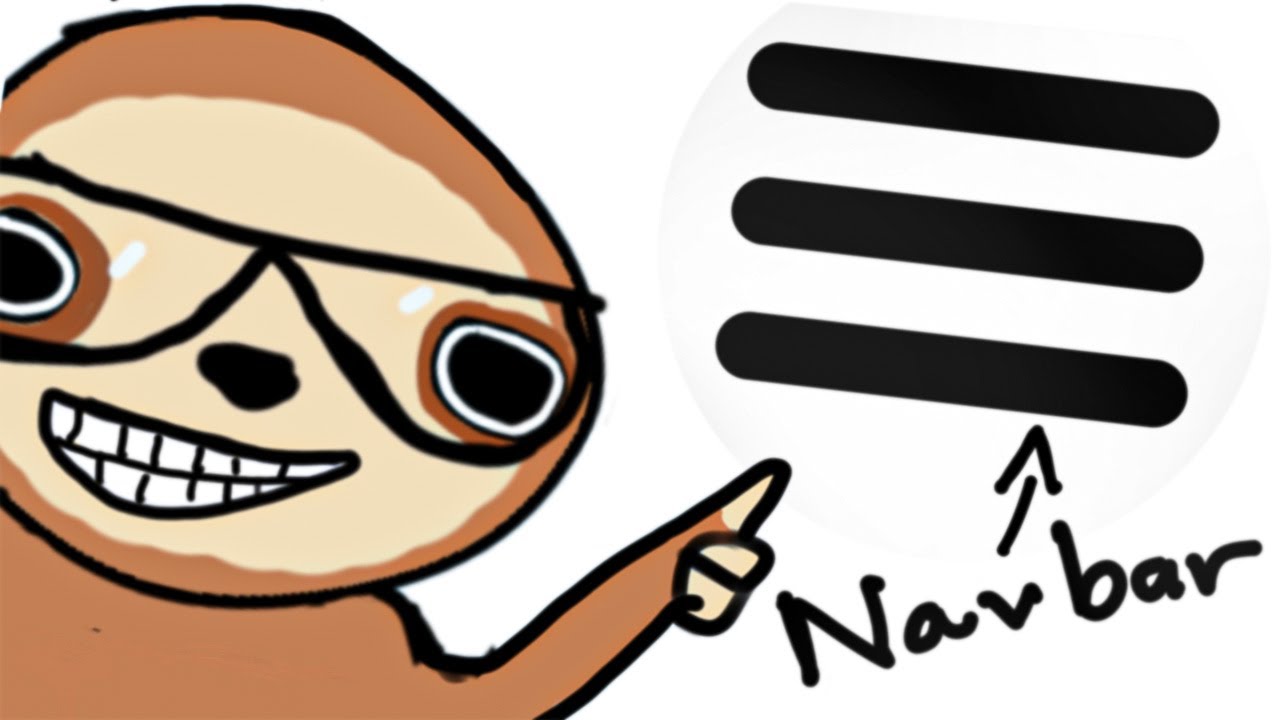
## Hero Section [00:00] It's sloth. Yeah. Hello. Do you know what this thing's called. Yeah. This section right here. Take a guess. I know you'll get it wrong because it has the goofiest name ever. Hero section. It's called a hero section. I know. I know. Kind of dumb. It's actually one of the most important sections on any website. The reason it's called a hero section is because just like a hero in a story or movie, it plays the most critical role in capturing visitors attention and drawing them into the content below. Yeah, that makes sense. Hi guys, I stole this definition from this blog post for magic UI because I had no idea why it was called a hero section either. Now, a hero section is usually this big area at the top that contains your main headline, some supporting text, and usually a call to action button or a CTA. Your hero section is supposed to grab attention and communicate what your website does in about 3 seconds because that's how long you have before users leave. You'll see this section everywhere. They can have background images, videos, animations, whatever. But the job is always the same. hook the user immediately. The tricky part is making them work on mobile. So yeah, hero section, terrible name, important component, and that's exactly what this. ## Navigation Bar [01:00] video is about. UI components that are pretty important. You see them everywhere, but you probably don't know the actual names for. I'm going to go through the essential ones every programmer should know because honestly, half of building a good UI is just knowing what these things are called so you can Google them properly and of course copy and steal. I mean, take inspiration from. Plus, when you're working with designers or other developers or I guess nowadays AI, you're going to need this vocabulary. You can't just say that spinny thing or those little dots at the bottom, you need to know the actual names. And when I say UI components, it could be something like a specific HTML element like a button, an entire section of a website like the hero section, or just general components that you see all the time, but you didn't know had an actual name. Either way, it's good to know the names of these components and what they do. So, let's move on. We'll start with something simple to warm you up. Let's go with the navigation bar. You see this horizontal menu. Oh, by the way, these components aren't ordered in any specific way. I'm just going to be listing them randomly. Yeah, you see this hor Oh, and if you already know these UI components, cool. Good for you. I don't appreciate your existence. So, you see this horizontal menu at the top. That's your navigation bar. Or if you want to sound like a real programmer, you can call it a navbar. The navbar is basically your website's table of contents. It shows the main sections users can visit, and it usually sits at the very top, so users always know how to get around. I mean, I guess technically you could have it anywhere, but that might as well be a programming war crime, so don't do that. But on mobile devices, it usually collapses into a hamburger menu. Hamburger. Now, the hamburger menu is its own UI component, but it's still a part of the navbar. It's just packaged differently for smaller screens. The name is pretty straightforward. You know, it's called a navigation bar because it's literally a bar that helps you navigate. It's a very simple name. I wish other components followed that rule. Hey, where are you going. Do commercial break. Yay. Hey, hello. I I have this newsletter called Sol Bites. I I share pretty important I share some pretty useful programming information every week to make you a better programmer. All you have to do is give me your email. It's free. Yeah, you should check it out. Now, it's one thing. ## Mobin [02:58] knowing about these UI components, but do you know how to make them look good and not ugly. Probably not, because you're a programmer. Well, with today's sponsor, Mobin, you'll finally be able to create projects that don't hurt people's eyeballs. Mobin is a platform that lets you look at popular websites and mobile apps to help you find inspiration for your own projects and make them look good. It has thousands of examples and it gets updated every single week. No useless information. It's quick and easy to use and you'll always be up to date on UI trends and best practices. It's used by over 1 million designers and product folks from companies like Wise, Airbnb, Uber, Headspace, Meta, Pinterest, and more. So, you already know Mobin is high quality. I mean, look how easy it is to use. We just talked about nav bars, right. Well, with Mobin, I can do this. search, navbar, top navigation bar, and boom, we can see how other companies designed their navbars for both mobile apps and websites. And not only can we see their UI components, but we can also see specific pages and specific flows, like when a user creates a new account. Mobin records the entire process, which lets you copy, I mean, take inspiration for your own projects. So, if you'd like to try Mobin for free and start making beautiful projects, click the link in the description to get started. Commercial breakover. Yay. Breadcrumbs. ## breadcrumb [04:05] All right. You see these little trail of links here. These are called breadcrumbs. I'm not lying. I'm not pulling your willie or anything. Wait, this one also has a goofy name, but it's also very important. I swear. Apparently, the reason why it's called a breadcrumb is because it's borrowed from the story of Hansel and Gretle, where the kids drop a trail of breadcrumbs to trace their way back home, which is exactly what this component does. I stole this from this blog post from VWO because I had no idea why it was called a breadcrumb. Breadcrumbs show you exactly where you are in a website's hierarchy and how you got there. So if you're deep in some online store looking at a specific product, you can see the path that you've taken. This component is used everywhere. Google Drive has it. Your file path uses breadcrumbs. Shopping websites, mobile apps. If something has a path, it'll probably have a breadcrumb. The cool thing, and the most important thing about this is each level is clickable, so you can jump back to any previous level without hitting the back button a million times. It's super helpful for navigation. And on mobile apps, they usually get condensed or turned into a simple back arrow because there's not enough space for the full trail. And most users don't consciously notice breadcrumbs. I mean, they'll see them, but I doubt you know the name for it. If they're missing from a website, people get lost really fast or they get annoyed. It's one of those things that really make navigation feel more intuitive, so don't forget them. Testimonial section. You've definitely seen this section. You know, the ones that show off the good reviews for a product. This is called a testimonial section. It's pretty self-explanatory. It's a section where you show off what people are saying about your product. Now, testimonials usually include the customer's quote, their photo name, maybe their job title or company, maybe their social security and credit card information, and sometimes you'll see them in a carousel, maybe a marquee, or just individual cards. Now, if you plan on creating a SAS or business, this section is definitely important. The key to this section is to make them feel authentic. Real photos, specific details, maybe even linking to a full review. You know, it's a good idea to not use generic stock photos or vague reviews like great product. Reviews like that don't convince anyone. Bento grids. This component has gotten very popular because it usually looks better than just a bunch of rectangles that are the same size and shape. And as you can tell by the name, it's inspired by a Japanese bento box. Bento grids mix different size sections. Some are tall and narrow. Some are built like you. Wide and short, some are square. You'll see bento grids used for feature showcases, maybe for a portfolio, maybe some dashboard summaries. You basically use it when you want to display different types of content, but you want to make it look good. I think this component is great. I really like how they look. And uh as a bonus, you can check out bento grids.com and it gives you a bunch of examples on bento grids. Oh, they look so good. Skeleton screens. Okay, this is one of. ## skeleton screens [06:30] the most clever loading techniques you've never heard of, but you've definitely seen. So instead of just showing a spinning wheel or a loading bar, skeleton screens show you the approximate shape and layout of the content that's loading. So usually you're going to see these gray blocks where the text will be, maybe empty rectangles where images will load. And what's interesting is that your brain thinks it's way faster than staring at a blank screen or a spinner, even though the actual loading time is exactly the same. You've definitely seen these because pretty much every modern app uses this. Here, let me show you. If you go on your YouTube homepage and refresh the page, it's going to show you a skeleton screen. It's nice. Pagionation. You see these rows of numbers at the bottom. This is called pageionation. Now, pageionation breaks up large amounts of content into digestible chunks. So instead of loading 10,000 search results on one page, crashing your browser in your computer, you'll get maybe 20 results per page with the controls to navigate through them. And there's a lot of different styles for these. Sometimes it's just a previous and next button. Sometimes it'll have a list of numbers. Sometimes it's that load more button. And sometimes it's not even there because of this thing called infinite scrolling, but they're all solving the same problem. But more modern apps seem to go for the infinite scroll approach. Every site with lots of content needs pageionation. But most developers don't think about it until they have like 500 products and the page takes 30 seconds to load. So if your project has a lot of content, make sure to add pageionation. Accordians, yeah, it's inspired by the musical instrument because it expands and contracts. An accordion lets you hide content behind clickable headers, so users can click on it and it'll expand to the content inside. Accordians are used anytime you have a lot of information that would overwhelm users if shown all at once. And honestly, it's one of the few components that has a good name. Calling it an accordion is way better than calling it that clicky expand thingy when you're talking to designers. So, make sure you have those in. Toast. You. ## toast [08:10] see this little pop-up message. This is called a toast notification. I have no idea why they decided to name it after a British delicacy. I don't understand these names. Just go with it. A toast is a temporary message that pops up to give you quick feedback about something that just happened. Form submitted successfully. Toast. An error happened. Toast. There's a lot of different ways you can create a toast. Usually, you define the states based on color. So, green for success, red for errors, yellow for warnings. The important thing is that they should appear briefly and then disappear automatically so they don't interrupt what you're doing. As for the position of these toast, the most popular is probably the top right, but it's really up to preference. You'll see them bottom left, the center, it all depends on the app. And there's also a variation of toast where they stack if you get multiple messages. Now that I talk about this, the name toast actually makes sense because they pop up like bread from a toaster. Okay, maybe the name's not that weird. Modals. This UI component is very common. It's this pop-up window that takes over your screen. You've definitely seen these if you have an ad blocker, and the name for this actually makes sense. It's called a modal because it puts your app in a different mode. You see how everything behind it gets darkened and you can't click on it. That's the key feature of a modal. It forces you to deal with whatever is in this pop-up before you can continue with anything else. Login forms, confirmations, images, settings. Basically, anytime an app needs your full attention for a specific task, a modal is going to show up. You can usually close them by clicking the X, pressing escape, or clicking outside of the modal. Good modals make it obvious on how to get out of them, but there's some modals that make it impossible to leave because they're so terribly made. Drop downs. This component is pretty straightforward for once. It's a UI component that drops down a list of options. Drop downs are super common for things like selectors, sorting, user account menus, or anytime you need to pick one option from a list, but you don't want to show all the choices up front. You got your basic drop downs for forms, button dropowns that reveal action menus, navigation dropdowns that show submen items. The tricky part about them is when there's too many options. Now, there's a variation of a dropown that's technically a different UI component, and it's called a combo box. A combo box is a combination of a drop-own and a text box, which lets you type and search through all the items inside the dropown. Good drop-owns let you scroll through long lists or even search within the options, and they also have to be pretty smart about the positioning so they don't get cut off by something else. Now, for mobile devices, drop downs often take over the whole screen or slide up from the bottom because trying to select from a tiny drop-own list with your fat sausage fingers is basically impossible. Tool tips. Now, you see this little pop-up that appears when you hover over something. This is called a tool tip. Tool tips give you extra information about an element without cluttering up the screen, like when you hover over an icon and it tells you what it does. Tool tips are everywhere once you start looking. Good tool tips are smart about positioning. They appear above, below, or to the side depending on where there's room. They don't want to get cut off by the edge of the screen or cover up important content. Now, for mobile devices, tool tips don't really work because there's not really a hover state. So, they usually get replaced with a long press or they're just always visible. Badges. Now, you see these little colored circles with the numbers or text. These are called badges. And yeah, just like a police badge or a scout badge, they're indicators that tell you something important at a glance. There's a lot of different ways to do badges. You've got notification badges, status badges that say online or offline or do not deserve, and label badges that categorize things like new, sale, or featured. They're usually small and positioned strategically. Top right corner for notifications, inline with text for labels, overlaid on images for status indicators. The key is that they need to be noticeable without overwhelming the main content. It's a quick way to add extra information without taking up space. Radio buttons. I just wanted to mention this because of the name. You've seen these before. It's a button that lets you select one option from a list of options. It's called a radio button because they're named after the physical buttons that were used on old radios to select preset stations. When you press one of the buttons, the other buttons would pop out while leaving the one you selected pushed in. I stole that from Wikipedia because I had no idea why they were called radio buttons. Yeah, that was some components you should know. Okay, bye.